top of page


Skincare Brand & Visual Identity
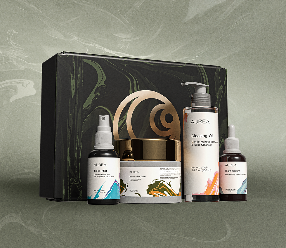
AUREA was developed around the concept of nighttime rituals as a moment of transition and restoration. The brand explores liquid psychedelia as a visual language to express flow, transformation, and sensory calm. This aesthetic choice reflects the fluid nature of the formulas and the gradual shift from wakefulness to rest, resulting in a visual identity that balances science, introspection, and contemporary skincare design.
Branding | Packaging


Brand Color System

Packaging Colors and Typography


bottom of page